The Buchstabenmuseum
Last year I was invited by a friend to visit the Buchstabenmuseum1 in the S-Bahn arches of Bellevue. I only knew that it exists but never got the chance to see it for myself - so I was excited to finally experience the museum with my own eyes. We even got lucky and had a small tour with Barbara Dechant, one of the founders of the Buchstabenmuseum e. V. And yes, there are letters everywhere.
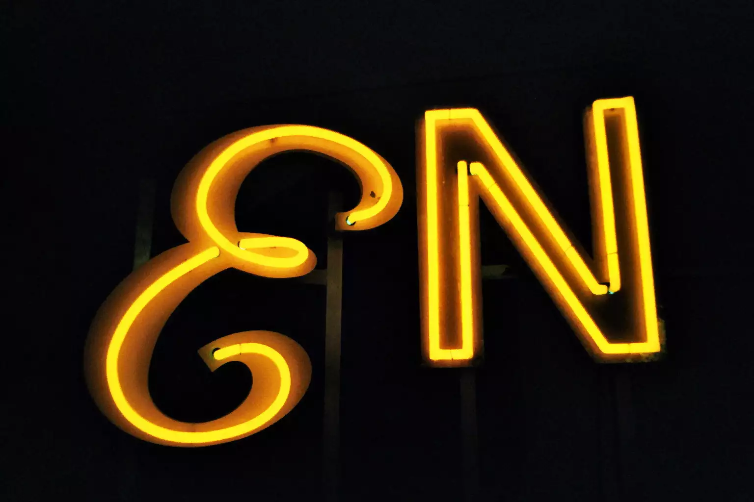
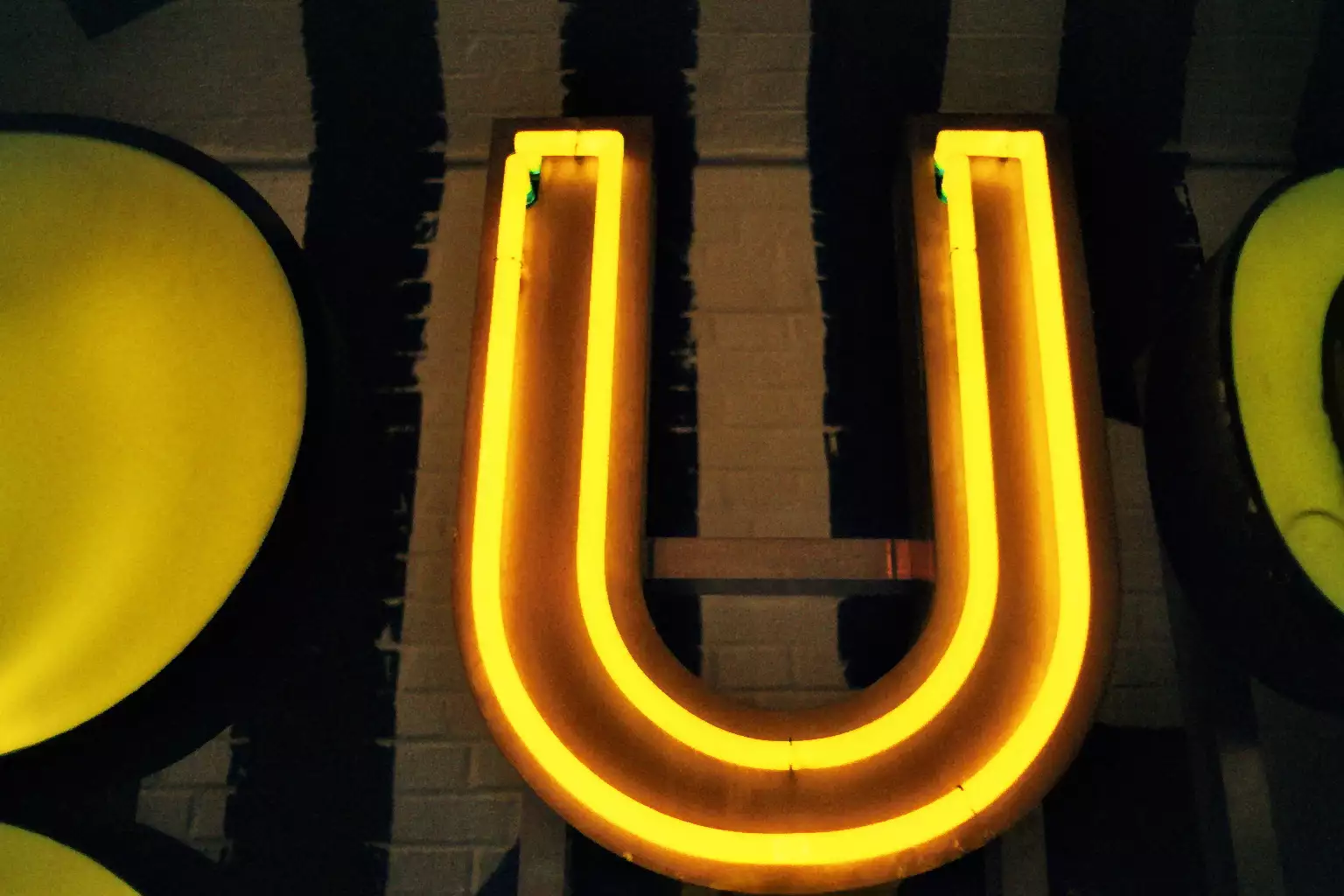
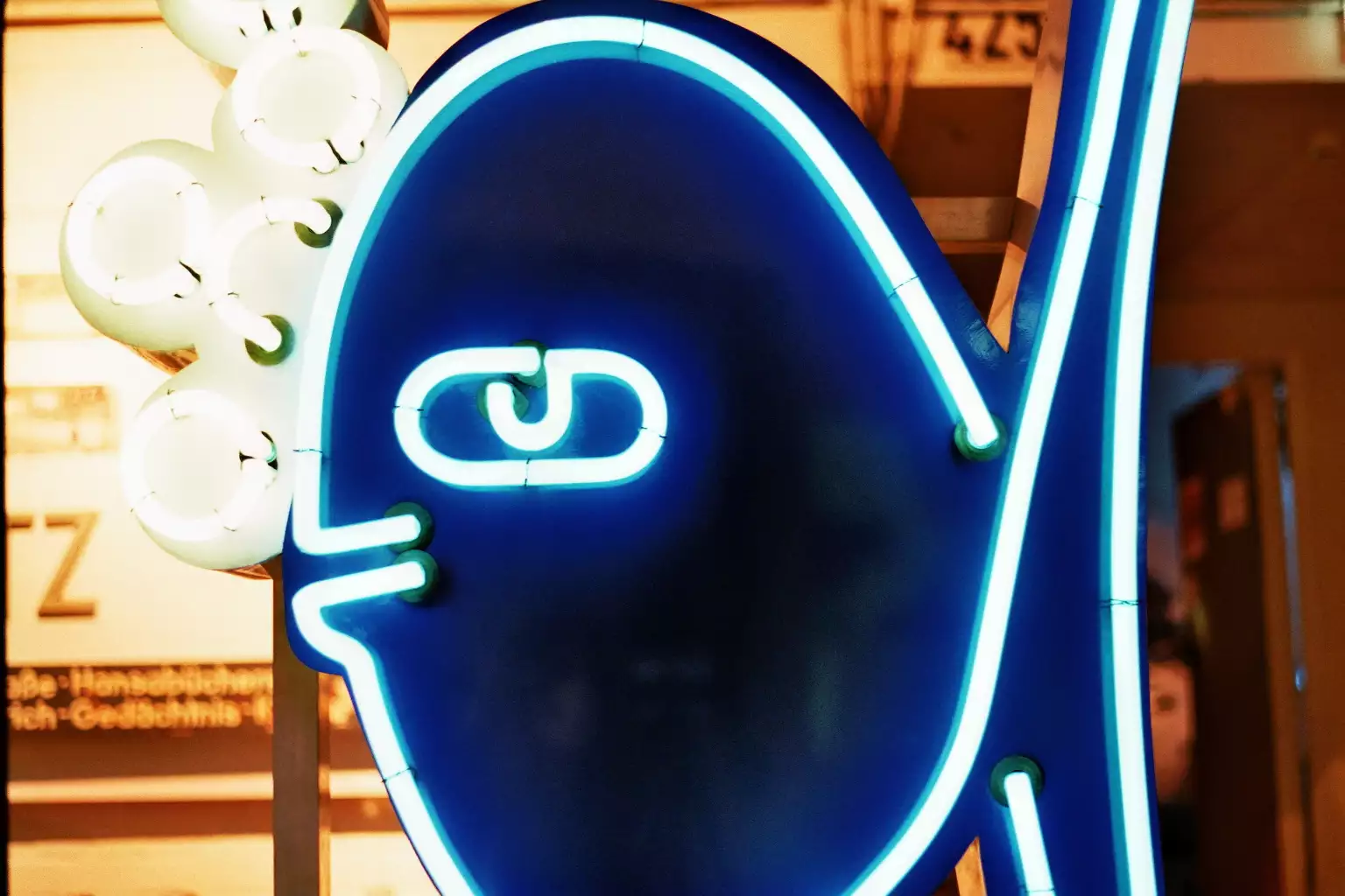
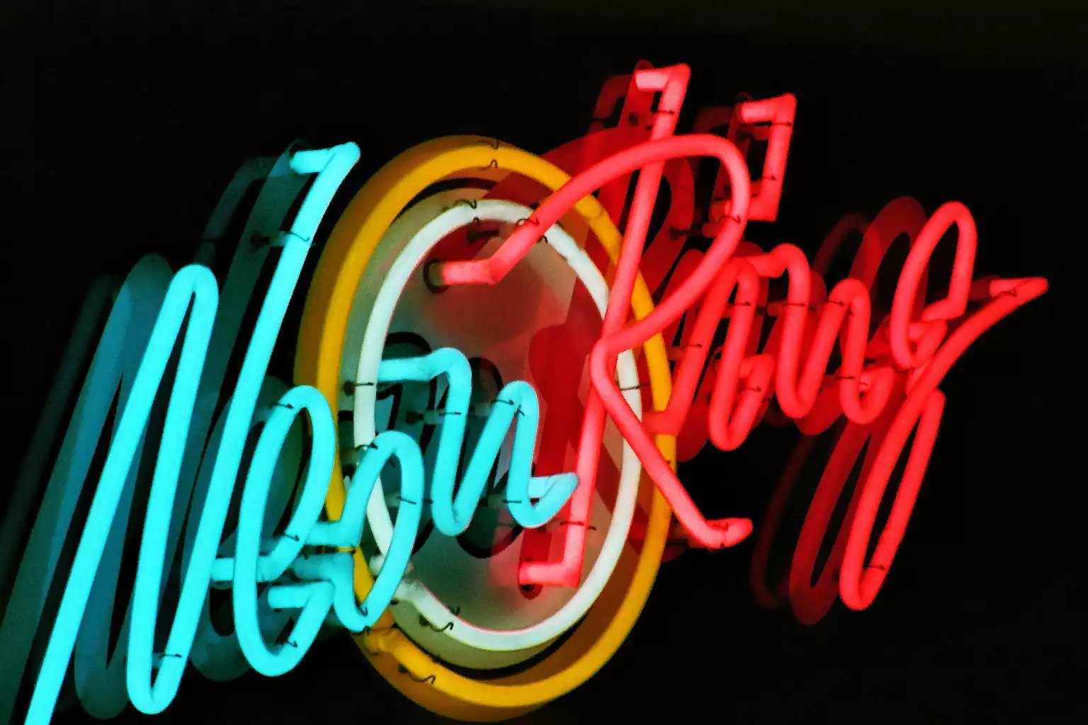
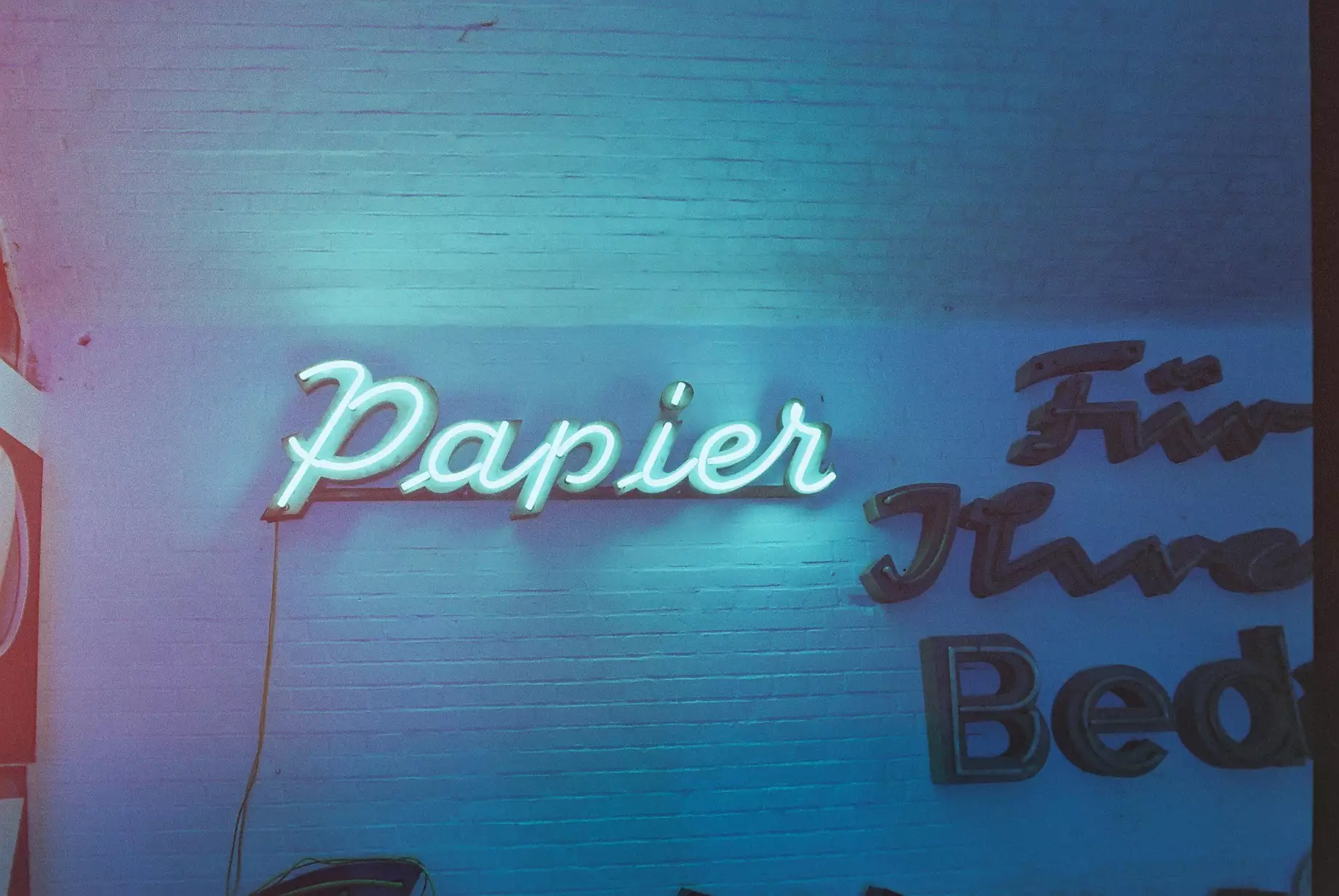
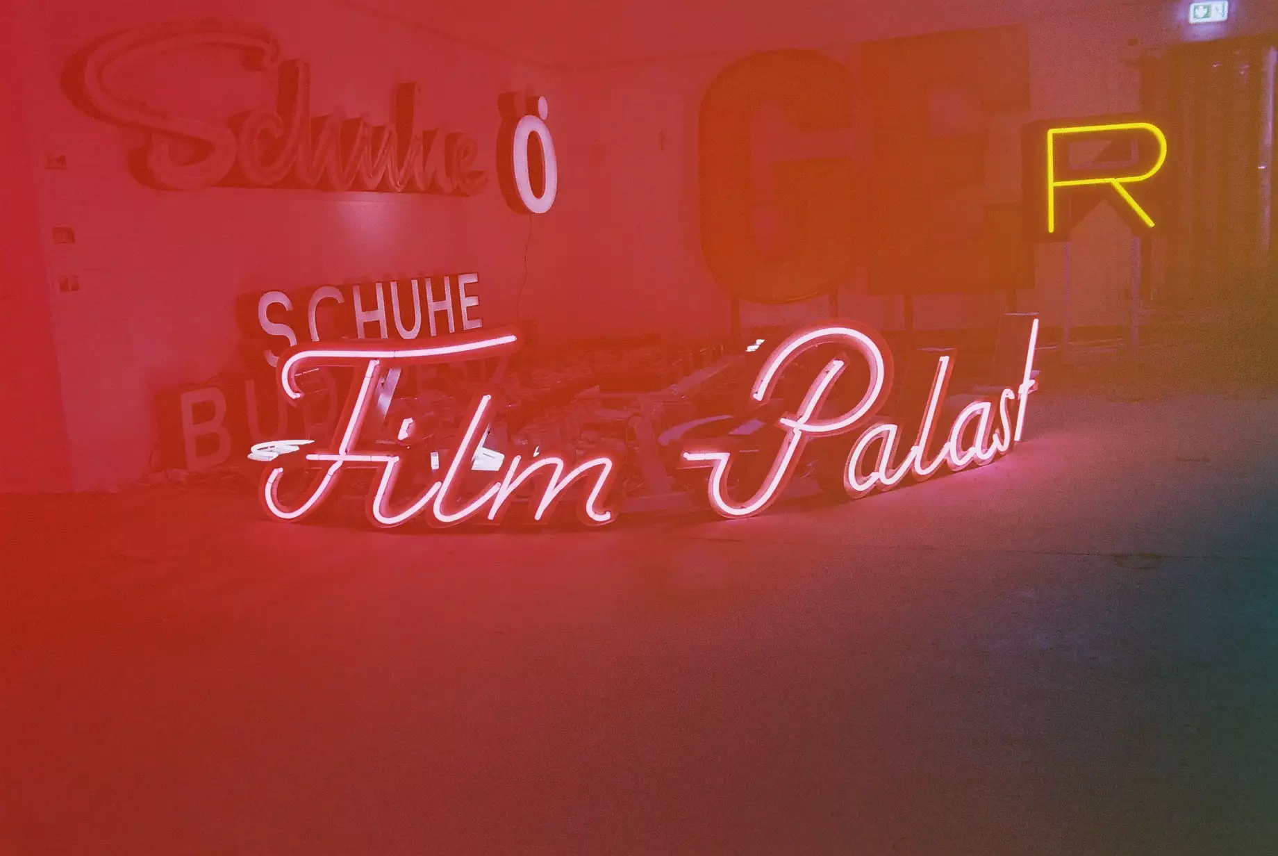
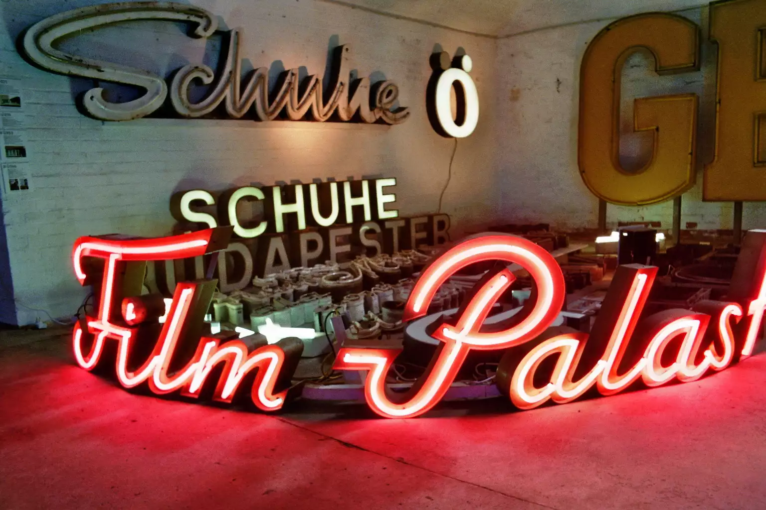
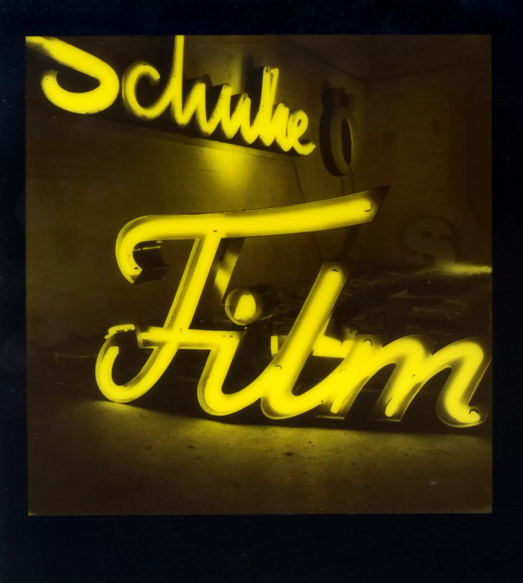
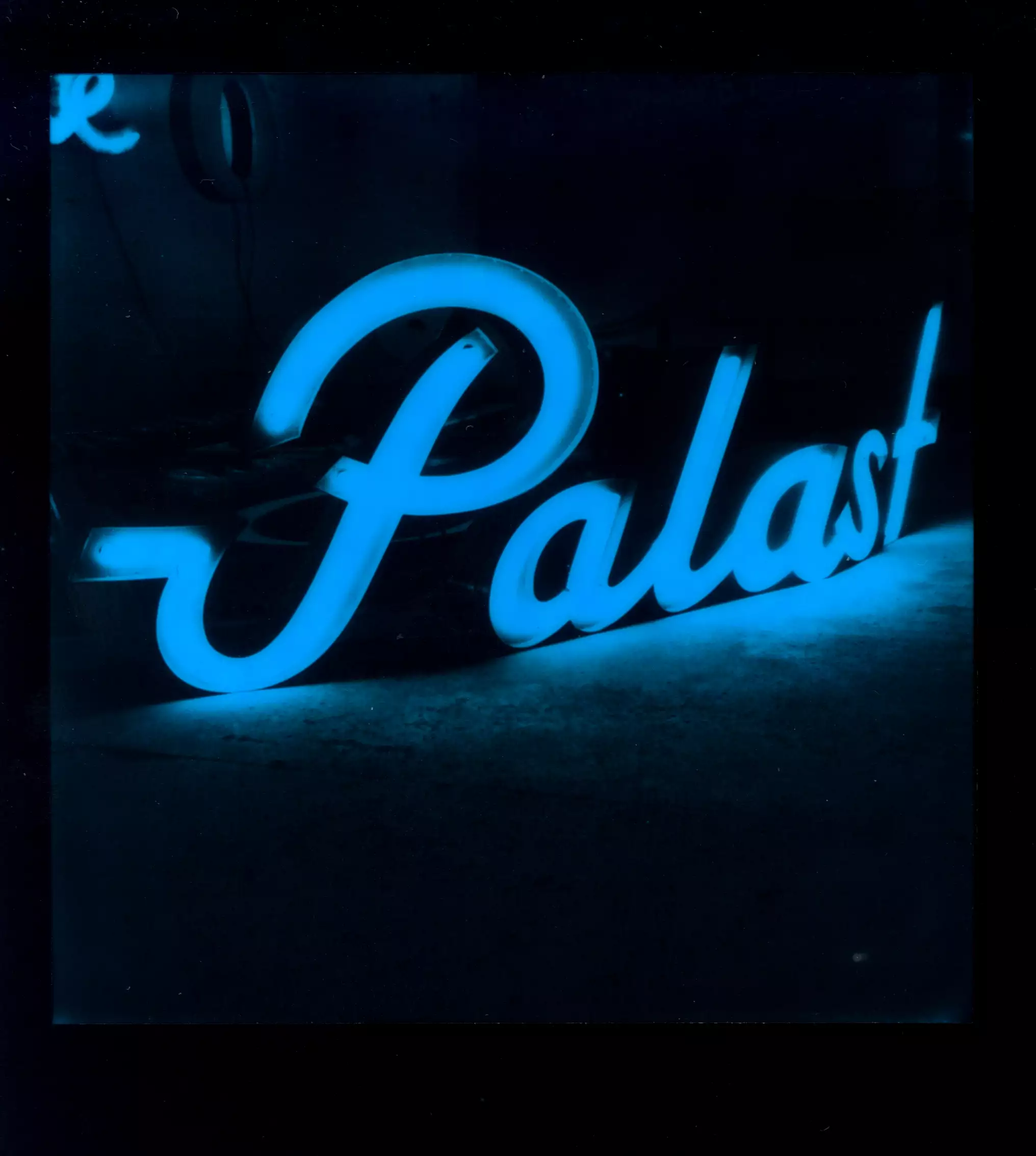
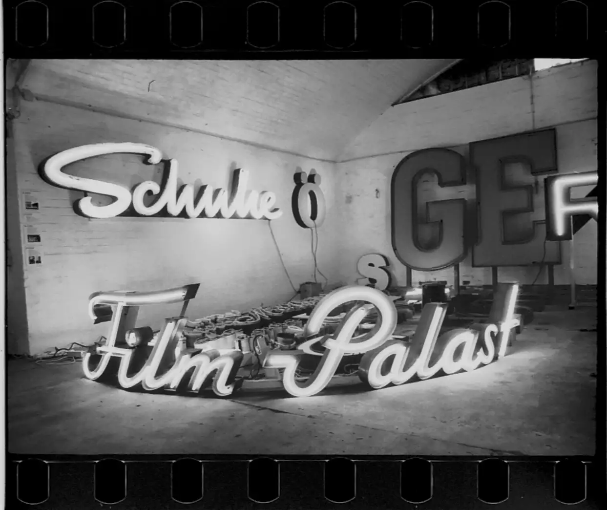
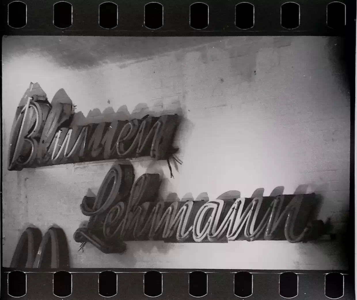
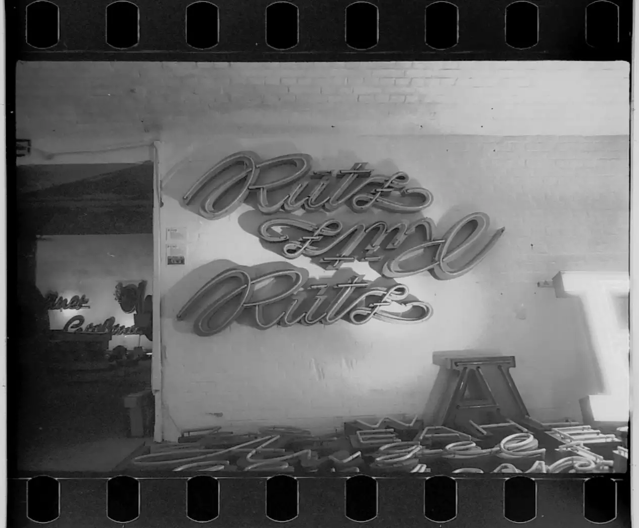
Letters from different shops scrambled together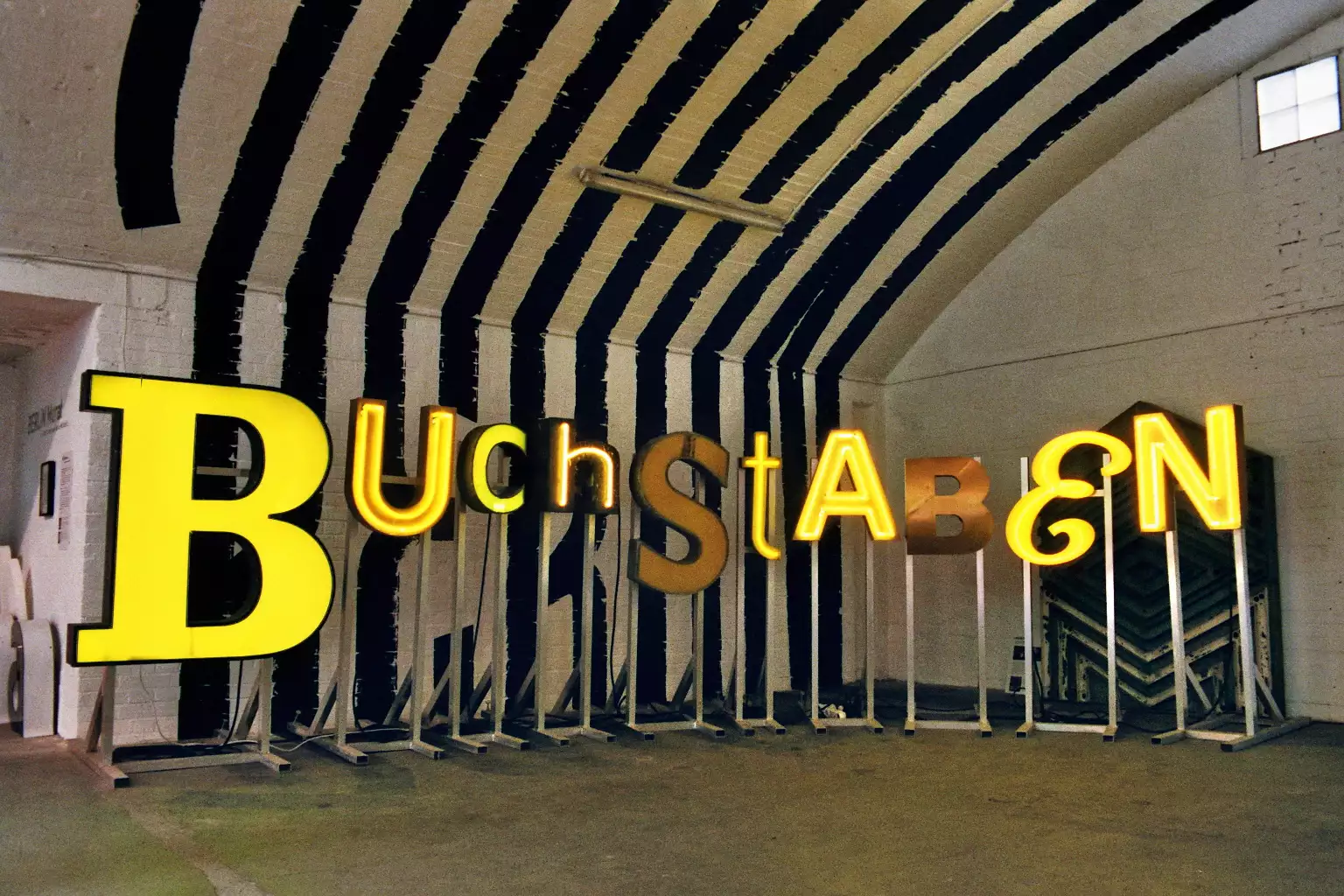
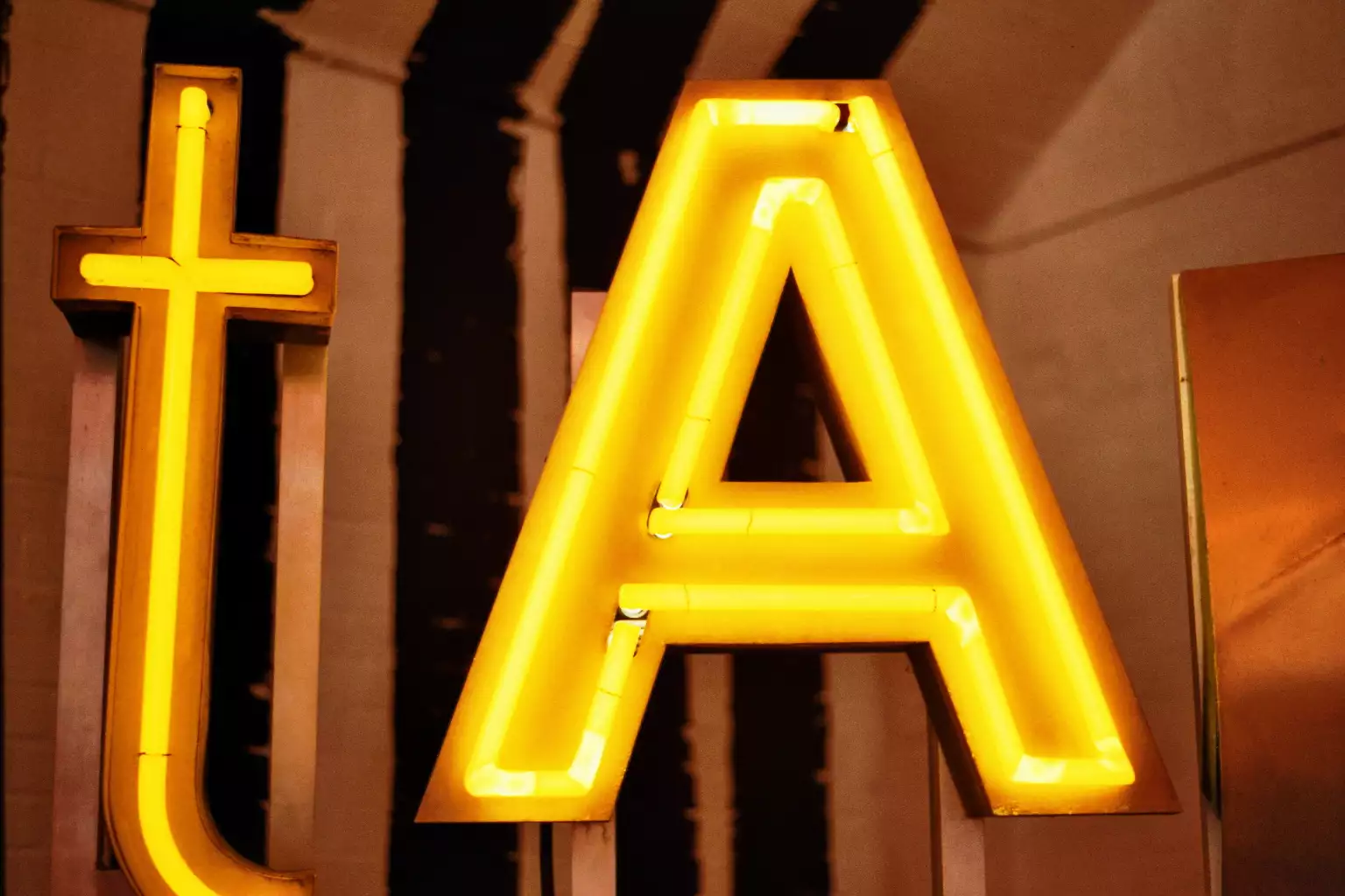
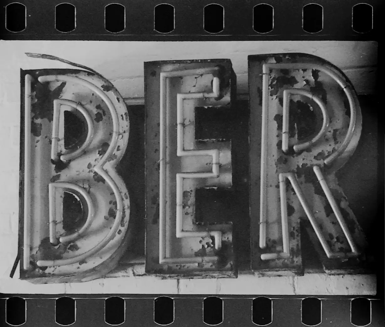
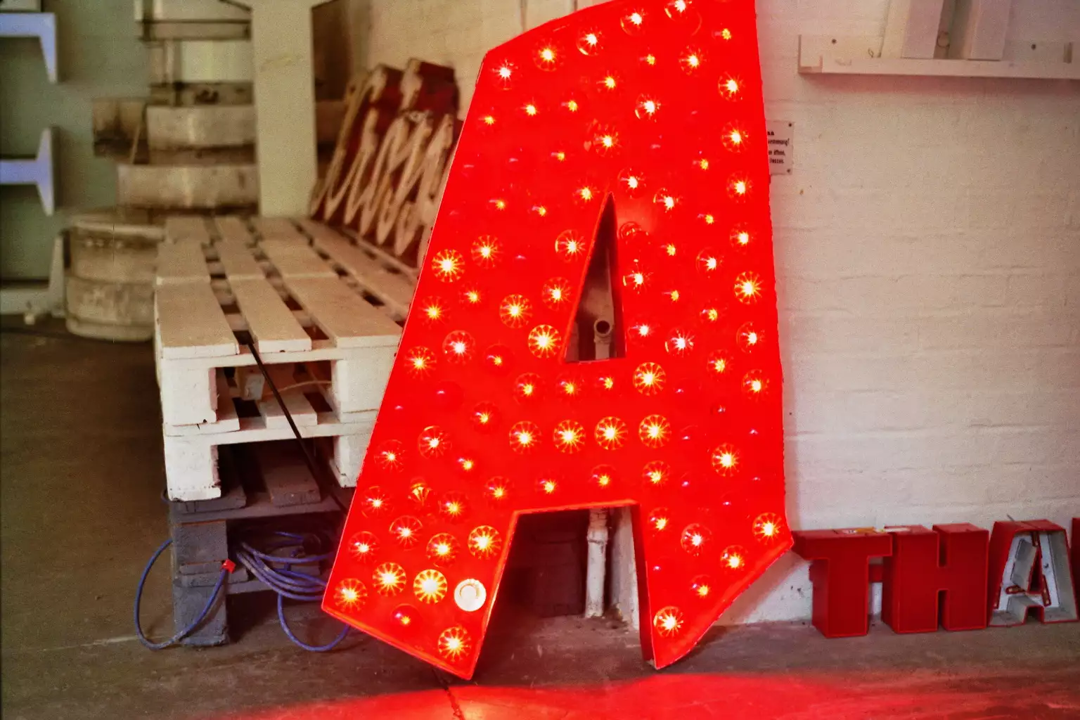
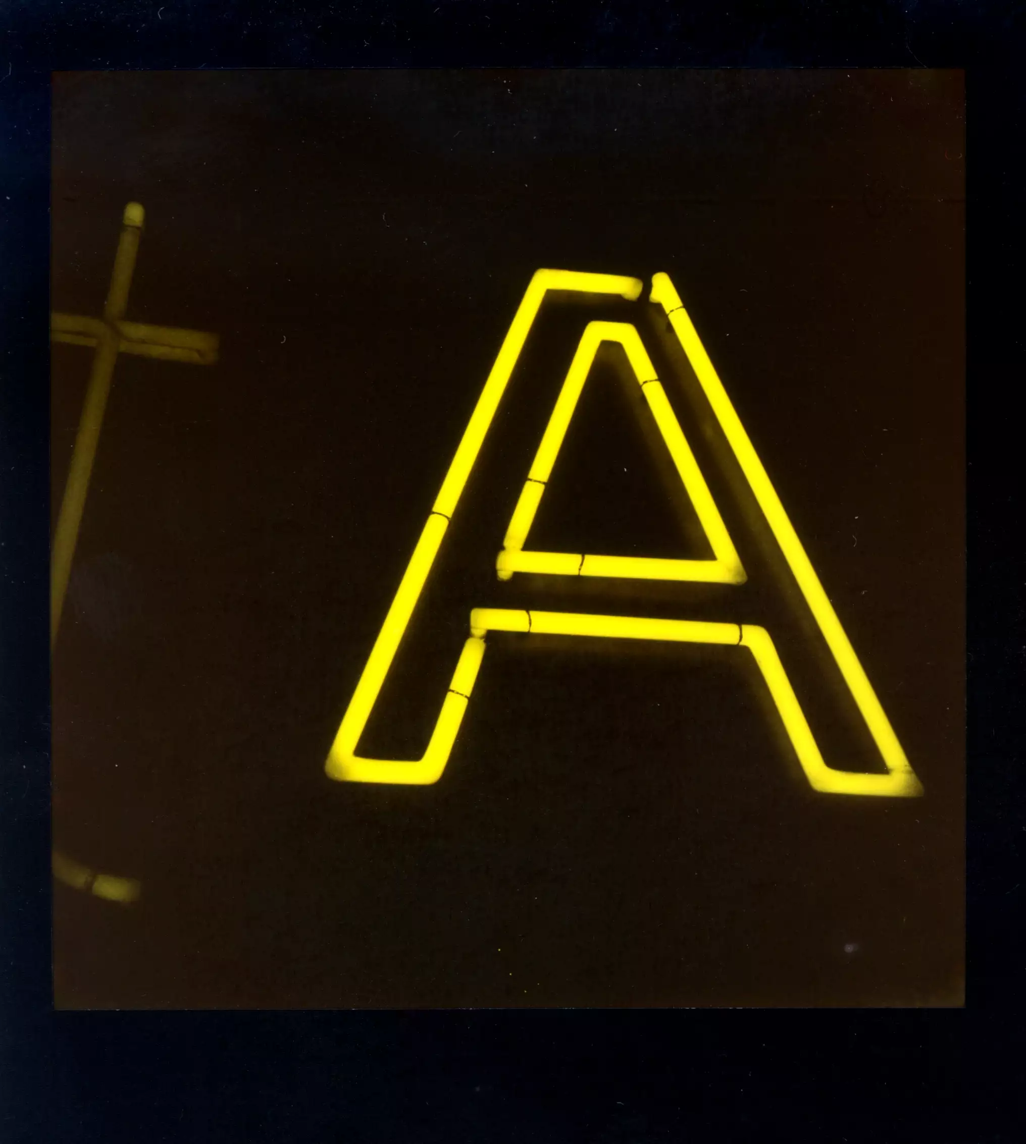
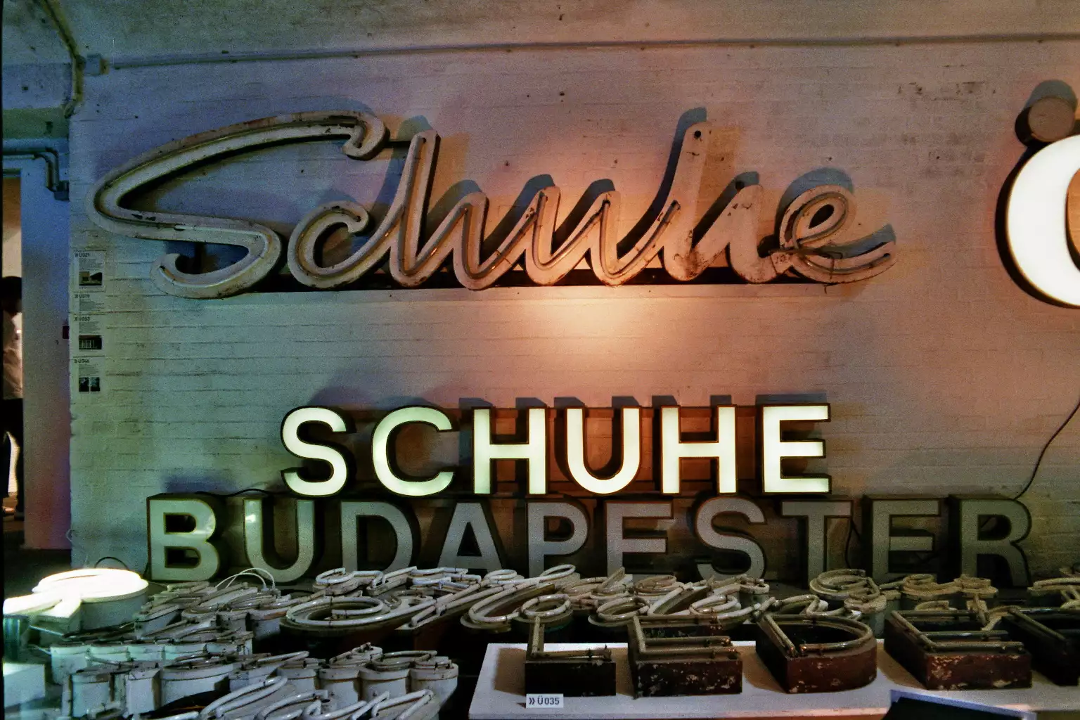
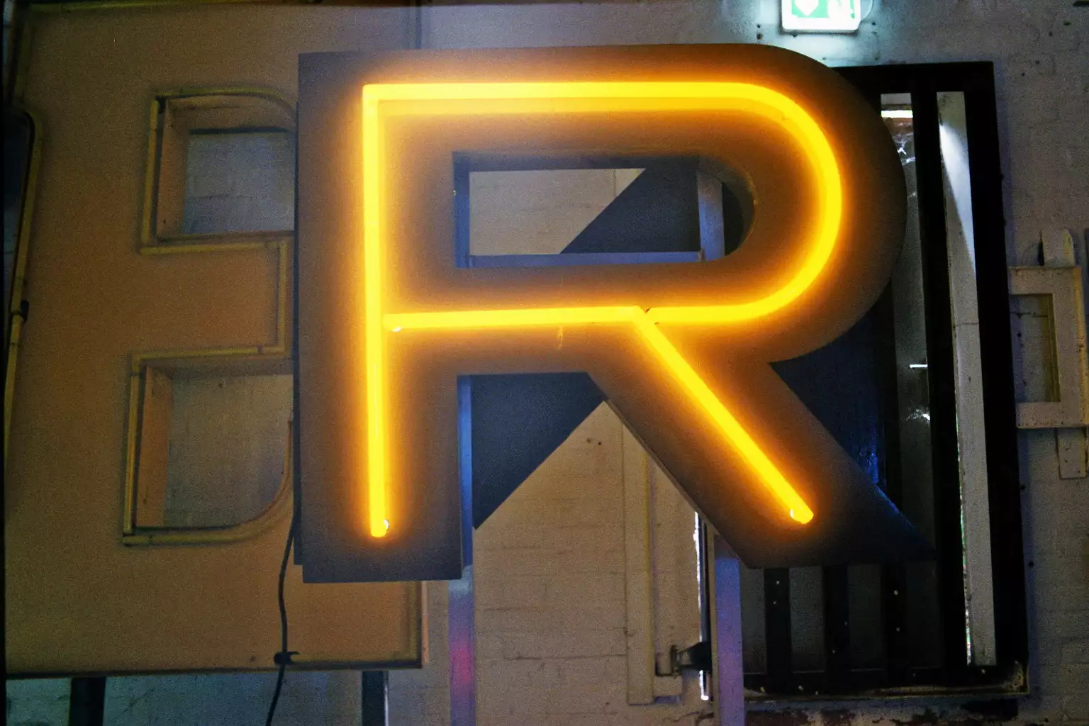
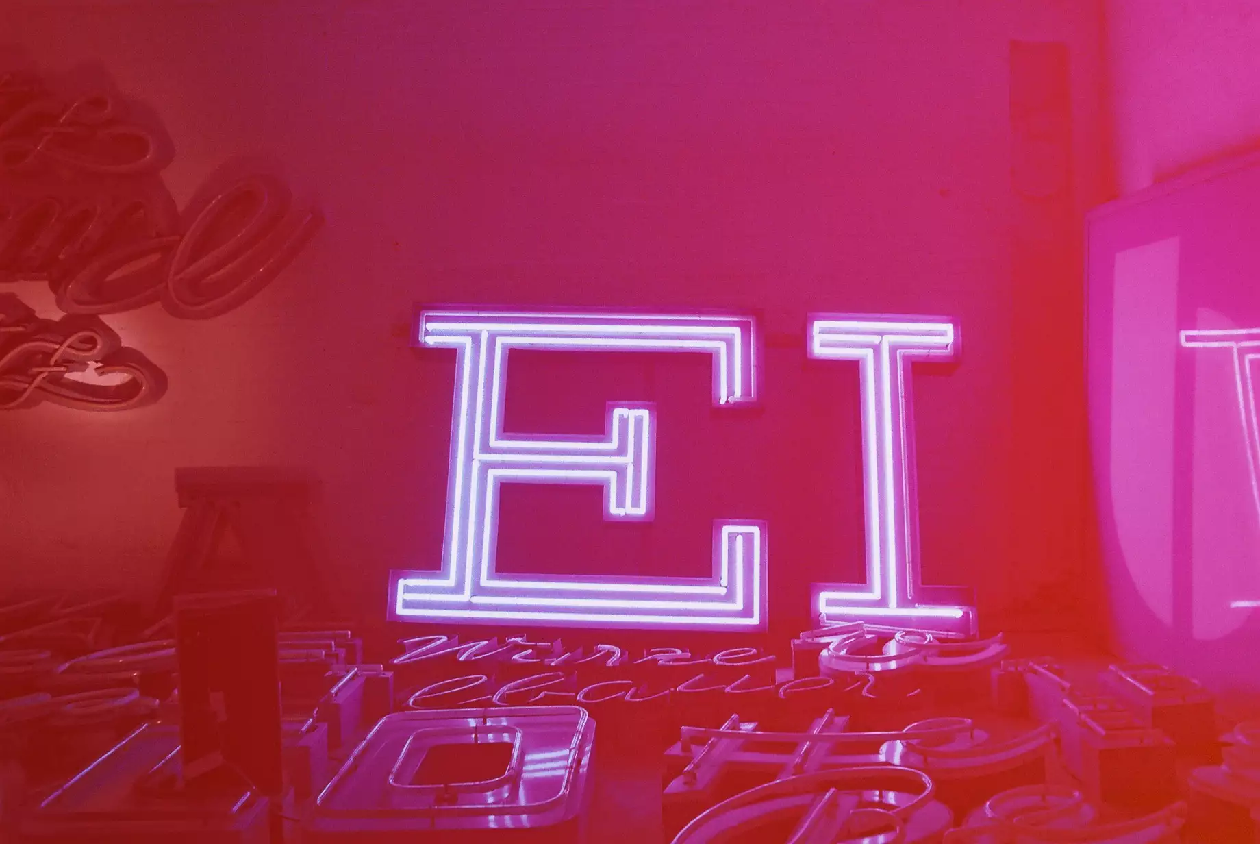
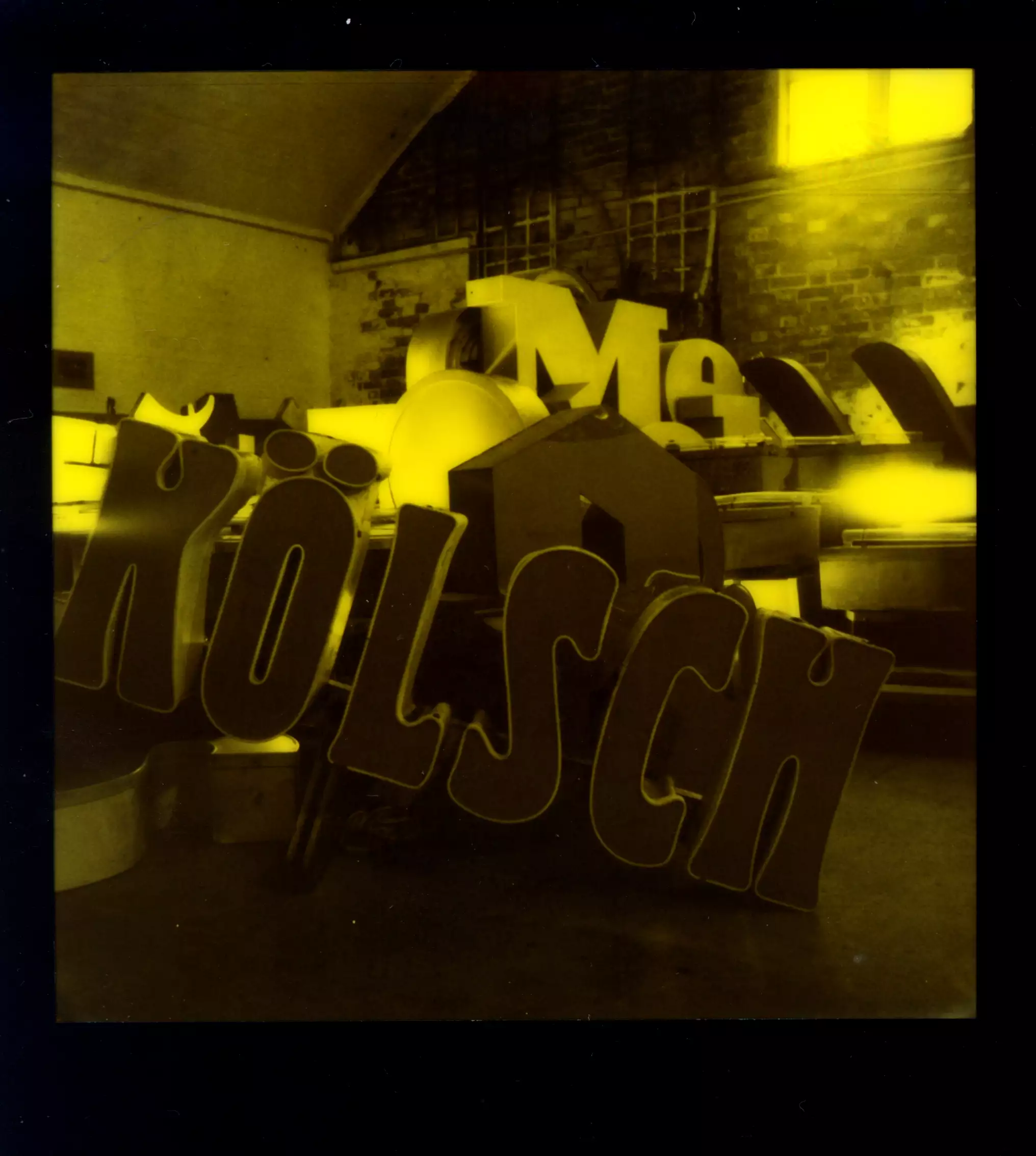
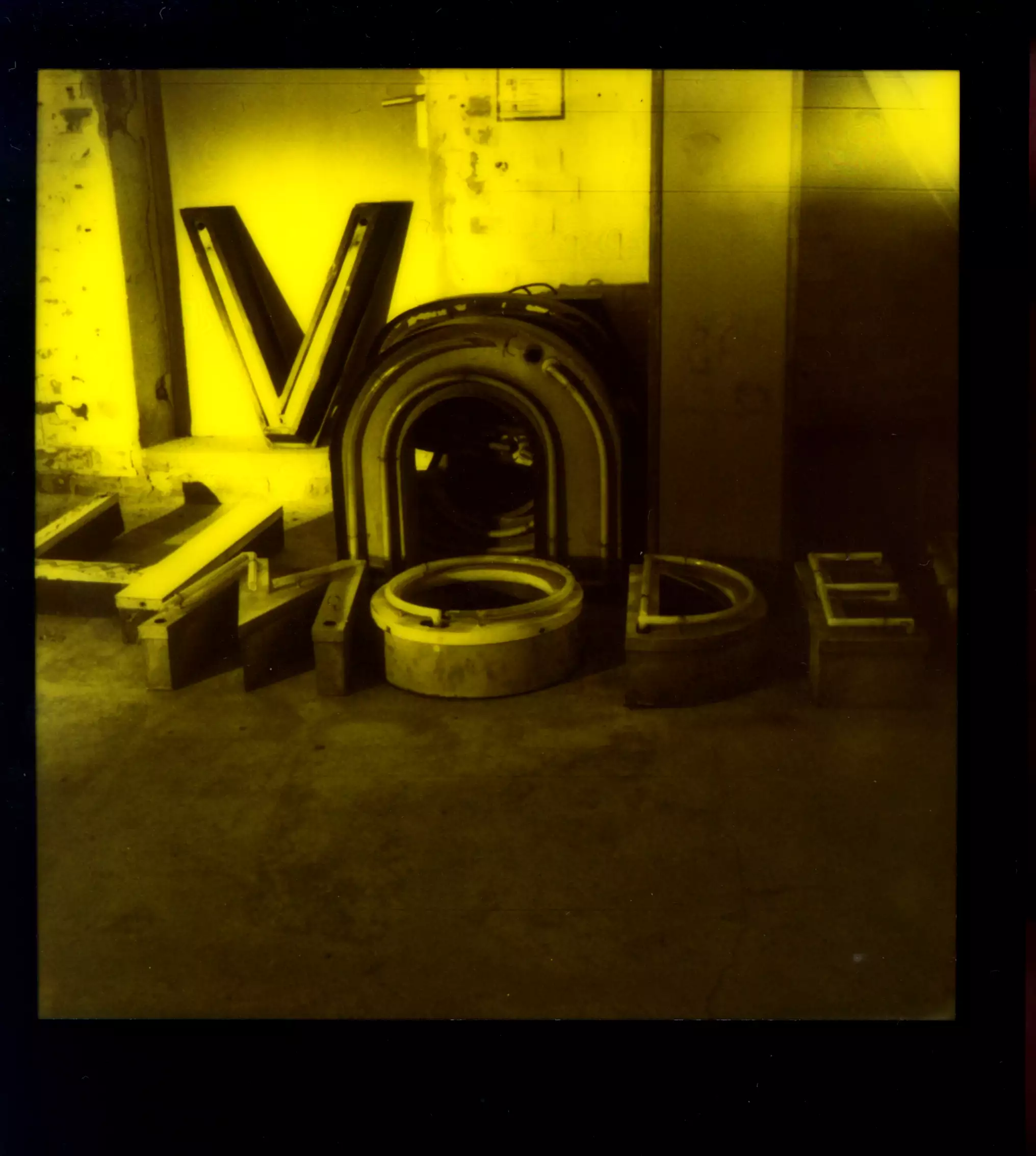
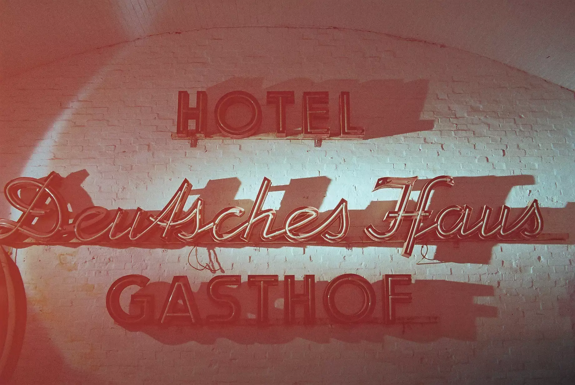
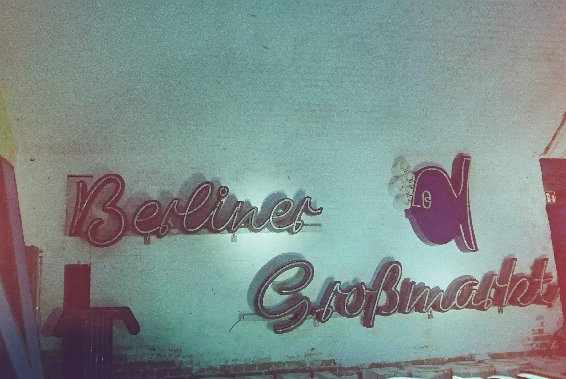
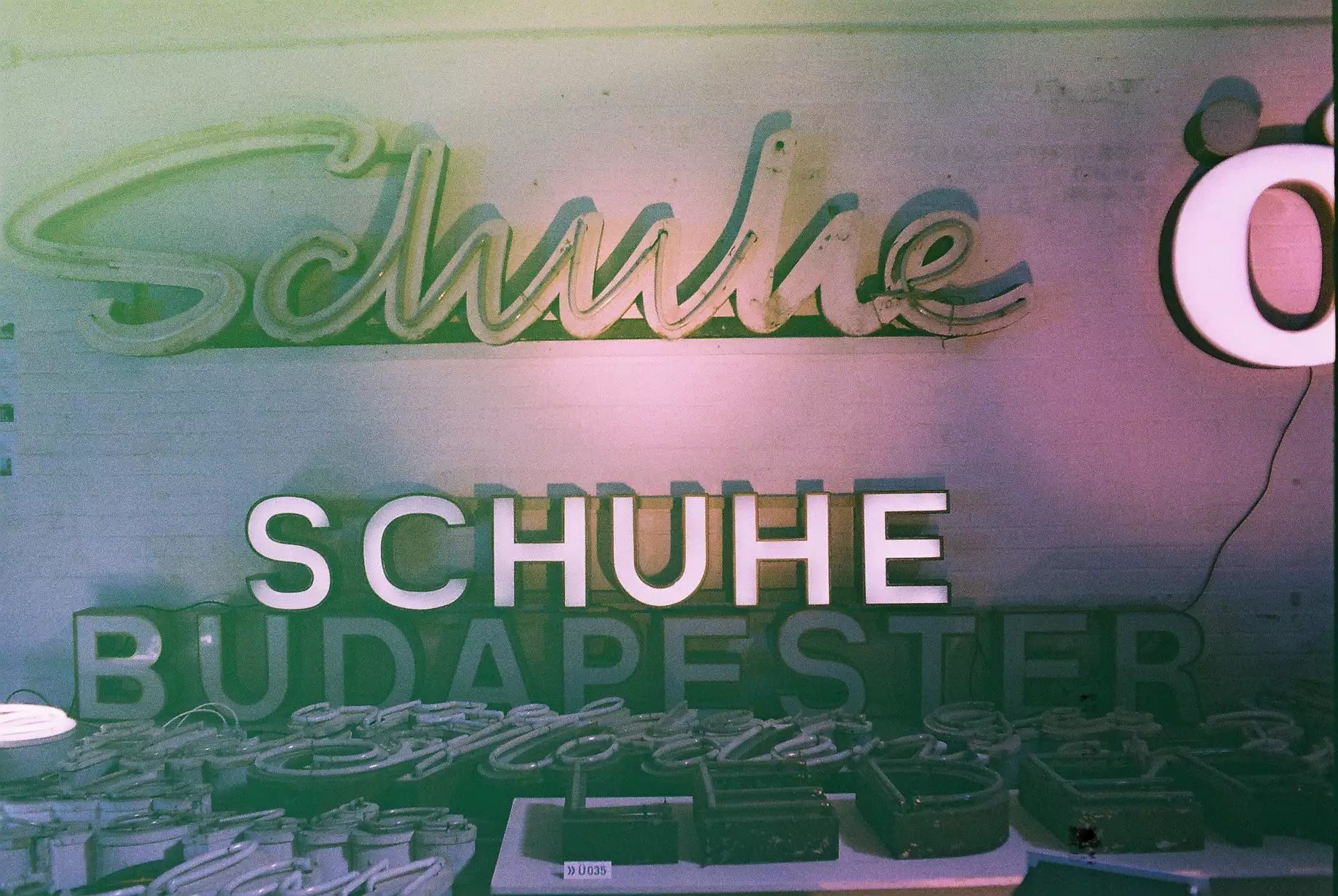
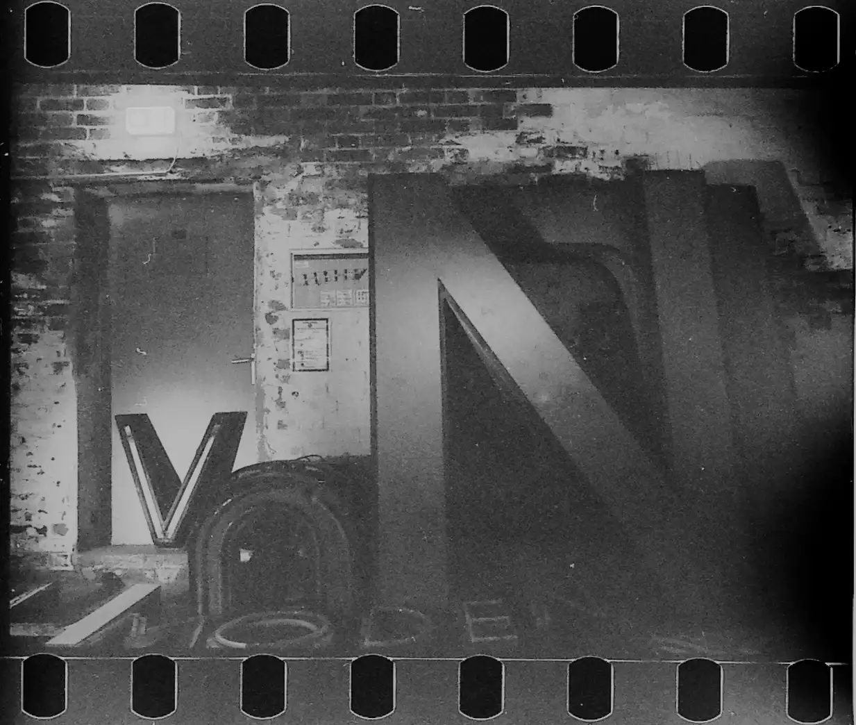
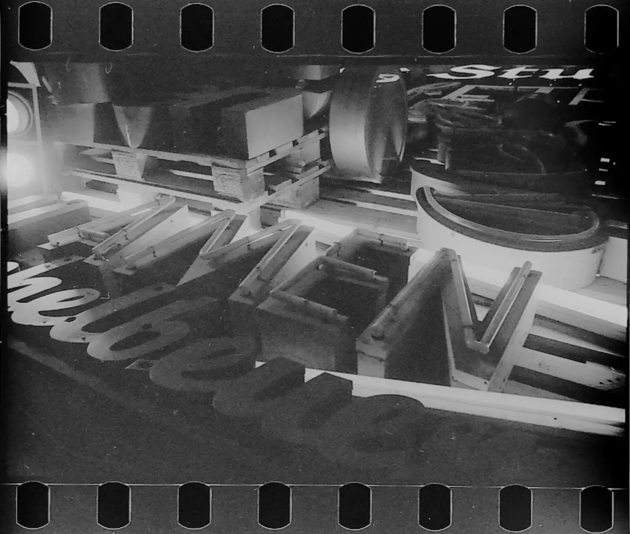
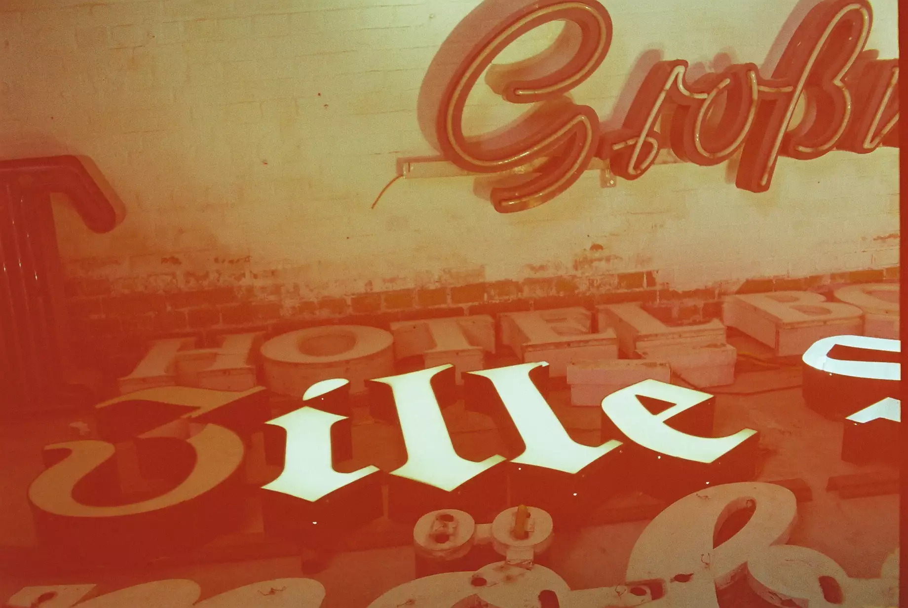
The S-Bahn arches give the museum a sort of letter graveyard vibe because here are neon signs that were outdated, replaced or removed due to house demolitions. Normally they would have ended up in the garbage but the Buchstabenmuseum saved them. It also managed to obtain a neon sign workshop, so that they can repair the old neon signs so that they can shine again in their old glory. There are over 2,000 different letters and typefaces from public spaces and different eras - mostly from Berlin and its surroundings. There are some special letters which show some of the history of Berlin, like the H, A, U, P from the Hauptbahnhof Sign (which is now Ostbahnhof).
In a way, the museum is a testament to the passage of time. Most neon signs have been replaced with LEDs. LEDs have many advantages over neon: lower power consumption, cheaper acquisition costs, and much longer durability. LEDs are said to last up to 50,000 hours on average, while neon doesn’t even last half that time. LED diodes don’t usually fail suddenly, but rather become weaker very slowly. However, I think LEDs just don’t have the charm of neon signs. When I see old photos where neon signs flashed at cinemas, restaurants, and shops in different colors, one after the other, it really captures the spirit of an era.
Nowadays, such signs would no longer be approved. Outdoor advertising is regulated at the state level, and most advertising media must not cover traffic signs or lights, impair the view of the landscape, or distract drivers.
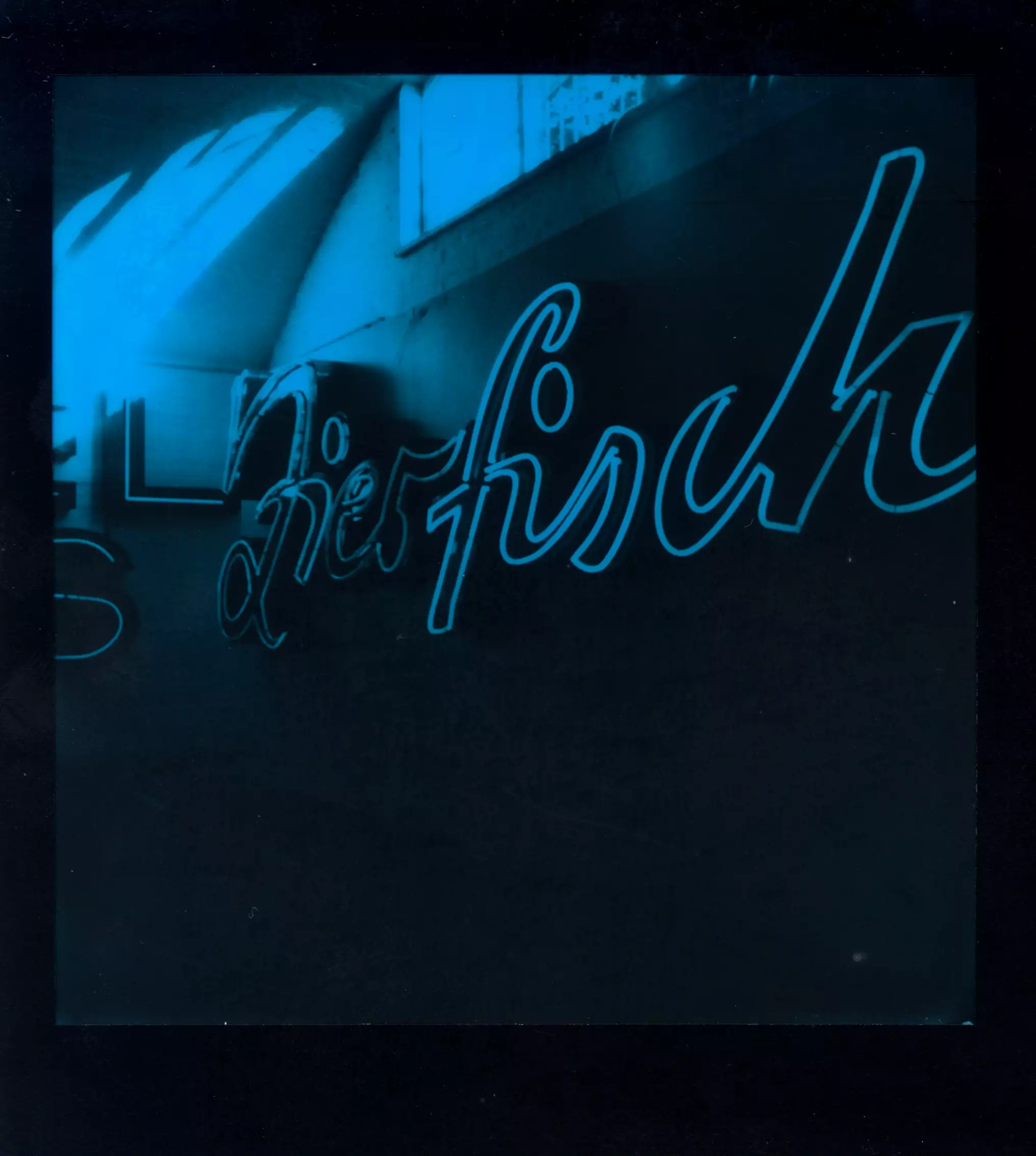
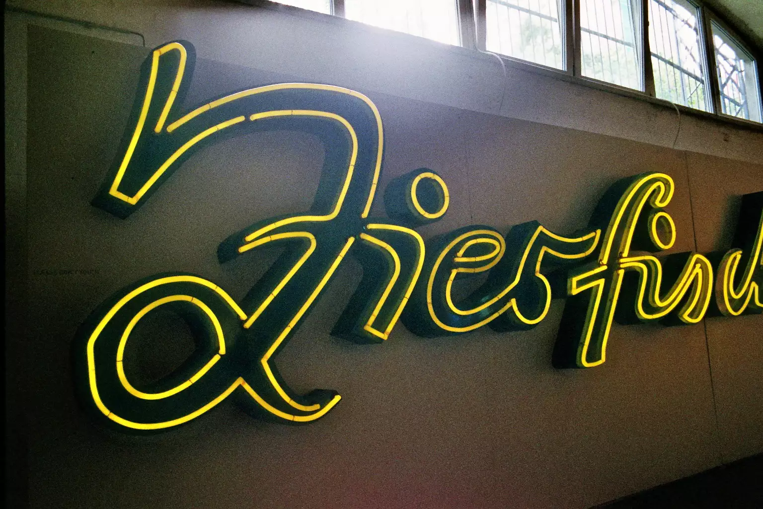
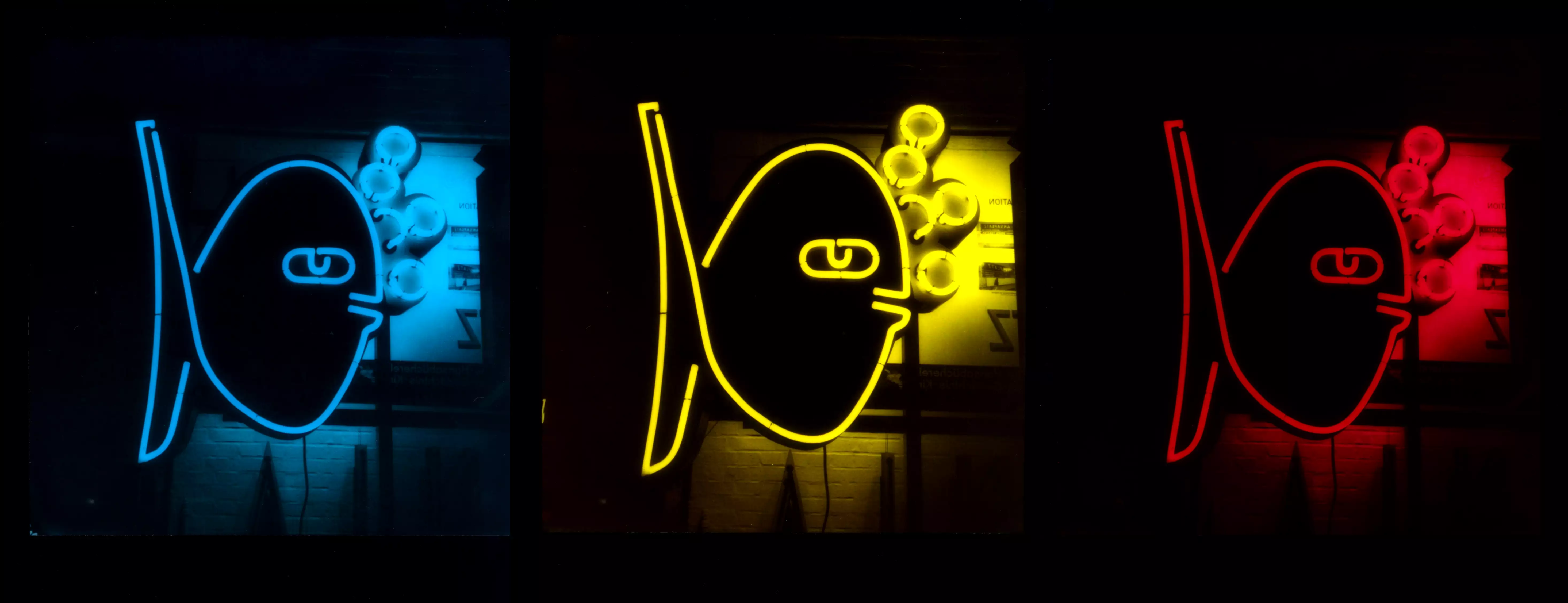
Despite all that, it’s fascinating to see the old fonts and typography. For some neon signs, it’s a trip back to my childhood - especially the Zierfische neon sign that once hung at Frankfurter Tor. The font is based on the handwriting of the script and advertising painter Manfred Gensicke, who also developed the sign2. I saw it often and really liked it, especially in the evenings. In 2009, the ornamental fish shop closed and the neon sign was removed. The Buchstabenmuseum e. V. acted quickly and saved it. It feels good to see it still shining
All in all, I really like the museum and what they do to preserve these old signs. I hope they’ll keep shining for a long time.
Volksbühne Berlin from the play ‘The Brothers Karamazov’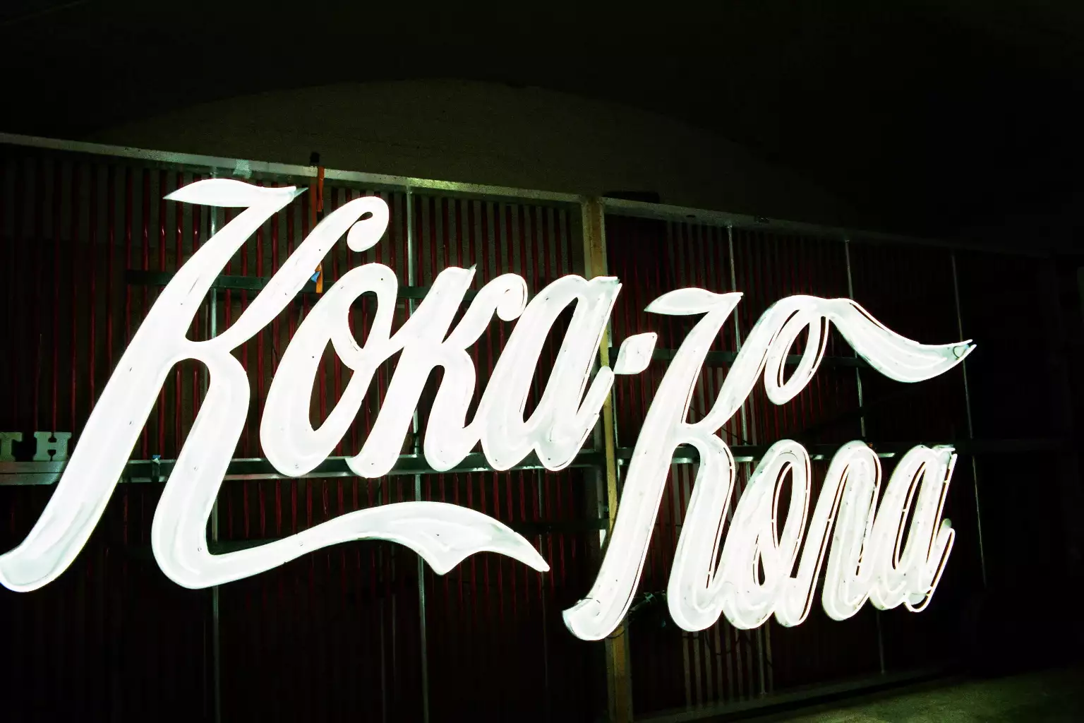
-
More info under https://www.buchstabenmuseum.de/ ↩︎
-
Most of the neon sign advertising for restaurants and shops in Berlin often came from the PHG Leuchtreklame in Prenzlauer Berg. Up to 35 people worked there in the 1980s with the whole process of glass blowing, letter making and metalworking. One of the ads they created were the ornamental fish. One of the larger objects was the 12-tube roof advertising for the VEB Pneumant in Erkner. Until the end of the GDR, they produced neon sign advertising for the Karl-Marx-Allee, Torstraße or Rosa-Luxemburg-Straße. ↩︎